
 Ratings
Historical Significance: Nil
Artistic Appeal: High
Symbolic Resonance: Moderate
Evocative Potential: High
I have a fondness for this deck because it was the first deck I ever bought and used. Without any knowledge of Tarot, in 1986, I wandered into Perelandra Bookstore (now defunct) in Eugene, and was immediately drawn to the collection of Tarot. I don't remember now why I chose this particular deck at the time, but for some reason I selected it--or the other way around. In any case, I enjoyed learning about the Tarot with this deck, and the readings were meaningful enough to keep me interested. Before writing this, I did the usual Web survey, and I find it interesting how many other people, in their reviews, also describe this as the first deck they ever had. I don't think that is a coincidence. The Hanson-Roberts deck, besides being one of the most popular after Rider-Waite and Marseilles, is very user friendly. If feels safe and non-threatening. It is a very good deck for beginners.
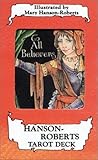
The artwork is pleasing. Ms. Hanson-Roberts used the medium of colored pencil with black ink outlines. This resulted in images that feel very soft with complex color gradations. The fact that it was printed with continuous color tone makes it distinct from most older decks printed with solid color using half-tone printing processes.
Hanson-Roberts is a skilled artist. Her compositions are balanced and appealing. Compared to older decks, the images feel fresh and contemporary. There are some Art Nouveau elements, but for the most part, the artwork draws directly from the familiar Rider-Waite images, although the style is quite different. The compositions are zoomed-in compared to R-W, with more detail, giving the feel of being close to the subjects. The symbology is very much paired down in this deck.

The style of the art can best be described as cartoonish. The subjects are uniformly warm and friendly, some so much so they are downright cutesy. There is nothing overtly scary or disturbing in this deck. The images and the readings from this deck feel very gentle, sometimes whimsical, and always affirming.
The meanings and symbols are firmly and predictably in the occultist Tarot tradition, most famously realized in Rider-Waite. There are no surprises or new symbolic schemes. The meaning associated with each card is much that same as with R-W and derivatives. As always, this deck comes with its own pamphlet, but if you're familiar with the R-W meanings, you will hardly need it.

It should come as a surprise to no one that Mary Hanson-Roberts, a long-time Florida resident, is an illustrator of comics featuring felines and all things cute and furry. Her best know comic, called Here Comes a Candle, was first serialized in the comic periodical, Furrlough, and, in 2000, was published as a graphic novel. She is an active member of the "Furry Art" community and is known to attend, sometimes in a place of honor, furry art conventions such as ConFurence and FurFest.
In any case, the Hanson-Roberts Tarot deck is a little too cute for my taste, but it still holds sentimental value for me, as it apparently does for many others also. It is a good starter deck due to ease of use and its kind personality. It is especially recommended for youth and anyone who experiences fearfulness at using a traditional deck.
There is also a companion guide available specific to this deck: The Hanson-Roberts Tarot Companion
If you like this deck, you might also have a look at her other deck, The Whimsical Tarot: A Deck for Children and the Young at Heart . . . it features, as you might guess, bipedal cats.


